User Interface and Experience / Flutter & Dart
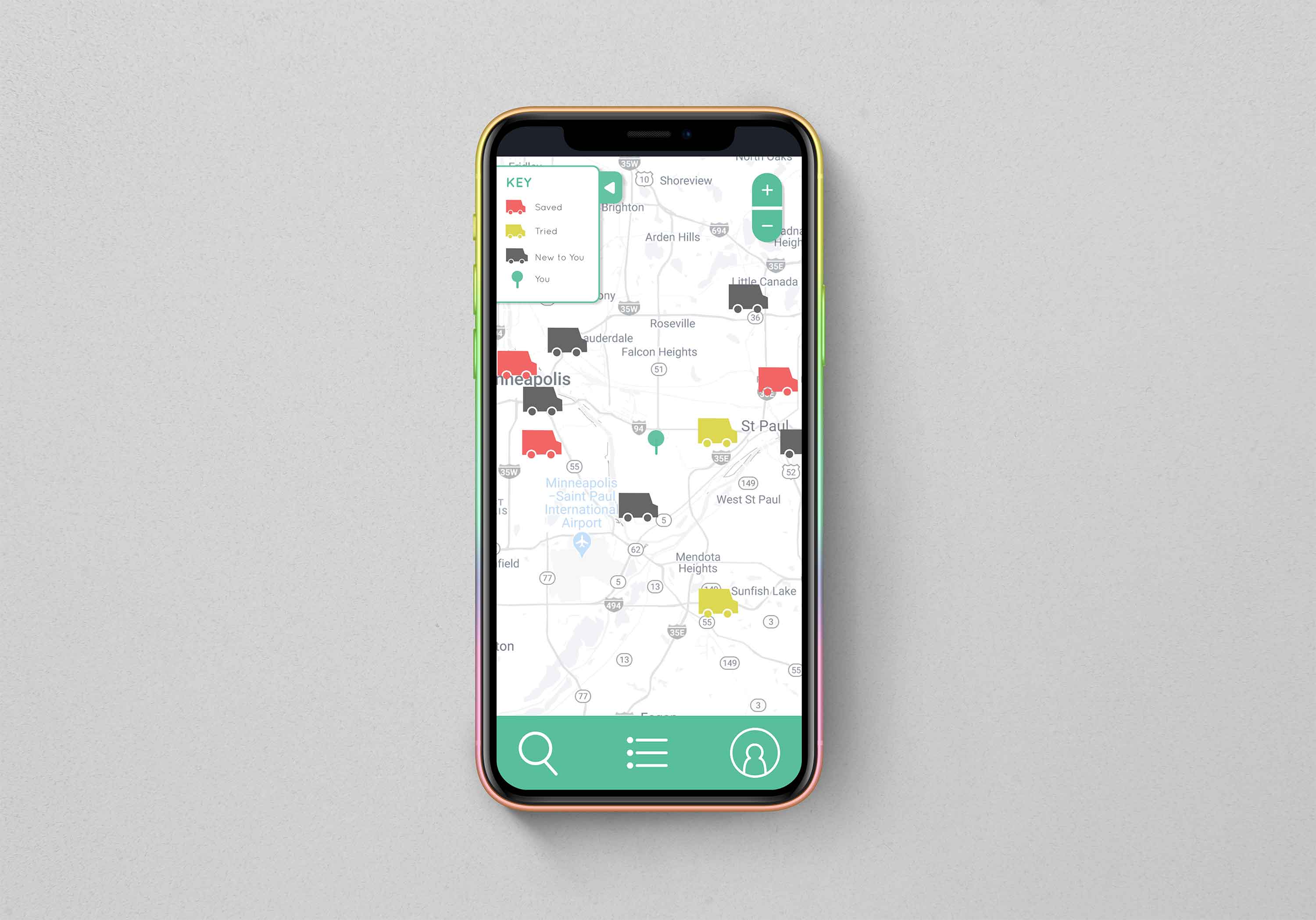
WanderTruck is a Food Truck Finding app for the Twin Cities metro area, where there is currently no comprehensive way to find local Food Trucks. The app has been iterated through rigorous user research, testing and evaluation, improving with each new prototype. The app is a continual work in progress, that will hopefully one day launch as a native app for both Android and iOS.

The most obvious problem is that an app of this nature doesn't exist in the Twin Cities area. Food Truck finding apps exist, but none service the area, and the majority aren't regularly updated. This presented a unique problem in that we couldn't ask users about other Food Truck apps they use in comparison, but instead, had to base research off of similar-intention apps.
Ages 21 to 34, brewery-goers and local to the Twin Cities
We specifically looked at users with a
penchant for breweries, with breweries often being the locale which Food Trucks frequent. Moreover, a
study done by
the Brewers Association revealed that millennials aged 21 to 34 are the largest demographic to frequent
a brewery today.

Based on user research, two primary personas were developed to encapsulate user tasks and desires, as well as pain points and needs that were addressed through user research, and general research.
We took to paper, and began sketching up interfaces, taking into account major points that users had made during the user research phase. We generate a word cloud, to find key words which were repeated, such as location, proximity, map, menu, etc. Prototypes took into account user task descriptions that were formed after parsing through user research, and persona development.

Using Adobe XD, a wireframe was produced to investigate how effective the interface was at addressing user needs and user tasks. Shown left are important screens from the low fidelity protoype, which demonstrate some of the core functionality at that time.

Complete functionality, where possible, was implemented for a high fidelity prototype, tweaked after considering user, and it’s interaction wires can be seen in the bottom right corner.
From here, we performed a cognitive walkthrough to understand some basic trouble points and issues a user might have with the interface, and it’s functionality. We ranked issues based on severity and used it as the foundation for building our app in Android Studio, using Flutter and Dart.

From here, we were able to develop the app, between myself and four developers. I handled the front-end design, and aesthetic coding, but also built out some of the app pages as well, in collaboration with the developers.
With changes made to the prototype, we then ran a Heuristic Evaluation to reveal further pain points and issues with the app. This carried us to the final evaluation process before we began user testing with a completed functioning protoype, made in Android Studio and Flutter.
With a functioning app, we were able to take it to users and see how the app fared. A number of interesting results came up, including the way users search and process results on a page. The full user testing report can be found below.
It is my hope that this app will continue to evolve and be iterated through, improved and tested, until it is ready for deployment to both Android and iOS app stores.